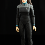
DST | Star Trek: The Next Generation | Enterprise Crew
 Diamond Select Toys and Art Asylum produced a large number of Star Trek figures in the last seven or so years. To be fair, I’m going to do my best to look at them as if it were back in 2006-2007 when these figures started to hit. Hopefully I can be as objective as possible and rather than each figure individually, I’m going to look at them as a group.
I give a lot of credit to Art Asylum for wanting to stick with using old techniques in creating sculpts and figures but the end results just don’t work anymore. Some of the McFarlane sculpts were closer to the source material back in the early 2000s so it’s hard for me to be generous just because they chose the more artistic approach. Sometimes they get it really right, and other times I don’t know what they were going for. I really thought they would be a cool company to follow since they did some really nice work on the Crouching Tiger, Hidden Dragon figures but I haven’t really been impressed by them lately. Even their Battlestar Galactica figures were decent, but not fantastic and that really hits me in the gut because I’m such a huge Galactica fan.
It should be noted that Captain Picard is from the Star Trek: Nemesis line because they never did one in the more recent Star Trek line in this particular outfit, and the Data head is also from the Nemesis line but placed onto the Exclusive First Contact Data figure because that head just looked bad. The rest are from the regular line although most were exclusives in some capacity.
Uniform-wise, they’re close but still a bit off to me. It doesn’t help that the texture and colors change from figure to figure, so it lacks consistency which really doesn’t even make sense to me. Were they reinventing the wheel every time they went to production? Even the communication badges change shape from figure to figure.
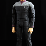
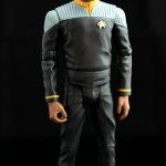
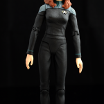
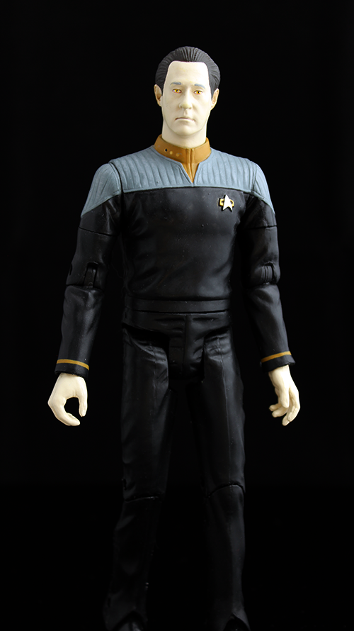 The head sculpts are either close, or bad, and even the close ones are off. Artistically I think it’s nice they tried to keep it old school, but you don’t get points for intentions or feelings. It’s the final product that counts. Picard and Data have acceptable heads and Riker has the best of the bunch. The rest of them are not good at all. I can’t even see Michael Dorn in the Worf head. Geordi’s eyes are just poorly painted and Dr. Crusher and Troi look like caricatures. The head sculpts are the luck of the draw and just all over the place when it comes to quality. For the uniforms, it’s kind of close, but it varies from figure to figure and this lack of consistency is not very appealing. Picard’s uniform is correct in spirit but it just doesn’t look all that great. Data’s and Geordi’s uniform doesn’t sit quite well and yet Riker’s and Worf’s uniforms look just fine. But then the materials used on each figure varies with some uniforms smooth and others having a more matte and rough finish. I don’t understand. I really don’t.
The paint work is equally all over the place. On one hand, individually it’s ok with some bleeding or slop, but collectively it’s worse. The colors of the gray shoulder area changes from figure to figure so there is no uniformity to the uniforms! For a uniform that is on the simple side, it’s inexcusable to not be able to match pantone colors on each figure. Some of the hands look bad with too much wash and some of the figures are just ruined by a mediocre paint job, especially Worf.
Even during the late 2000s, most figures had decent articulation and I really don’t know why Art Asylum went with the choices they made. Picard is very basic and can achieve most simple poses, but I hate pin ankle joints especially when it really breaks the look of the uniform as it does on him when he sits. For the other figures, Art Asylum employs a barbell type joint at the shoulder and they continued that technique with the Battlestar Galactica line. I really don’t get it because it doesn’t give any better range of motion than a ball-hinge joint. In fact, the articulation is limited by it and the figure has a hard time making a good iron cross pose or even putting his arms above his head. This joint is also very brittle so I could never understand the significant of it. For Data and Geordi, the leg articulation is really odd and is more prominent on Data where it makes him look like he needs to pee. Riker is probably the best of the bunch, but he’s basically par for the course in this scale. The female figures are also poorly designed especially in the hip area, and Dr. Crusher seems to like favoring one side because she just doesn’t stand up straight. Overall, it’s subpar even by the standards of those times because it’s easy to forget Marvel Legends was highly popular around the same time.
Each figure got something different with some having phasers, rifles, tricorders, medical kits or something else but it was usually limited to one or two items. I’d actually be satisfied with that but the figures can’t hold most of the items. The biggest offender is the rifle because while beautifully sculpted, nobody can hold it nicely. I think when it came to these figures it was a case of the left hand not knowing what the right hand was doing. To not include hands to hold these weapons is frankly insulting.
Well there’s no doubt these figures are solid pieces of plastic with some nice weight to them. The articulation though is fragile in the shoulders and once the barbell joint breaks, oh well. The paint is also easily susceptible to rubbing, scratches and fading. I have very little confidence they will last over time.
Even during their prime, these figures were average. I remember seeing the first wave of figures at San Diego Comic Con and was very close to purchasing them, but something just didn’t click and I passed. I love the Next Generation crew and really wanted a complete set with them in the First Contact uniforms, unfortunately I can’t really enjoy them for what they could have been. I’m hoping at some point another company gets a shot at them and produces either really good 6″ figures, or even better 3-3/4″ scale figures with playsets and vehicles.
For Art Asylum, I think it’s time to either change with the times or get out of the game. People may not like that fact, but time waits for no one, and these figures would not do well in today’s climate.


Custom: Sistar | Bora

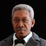
Custom: The Dark Knight Trilogy | Lucius Fox
Mod: Hasbro | Star Wars Black 3.75″ | Darth Vader (EP III)

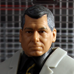
Mattel | WWE Exclusive | Vince McMahon
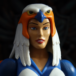
Mattel | MOTU Classics | Sorceress
Mattel | WWE Elite | Undertaker
Leave a Reply